May 1, 2015 | A Marketing Blog, Blog
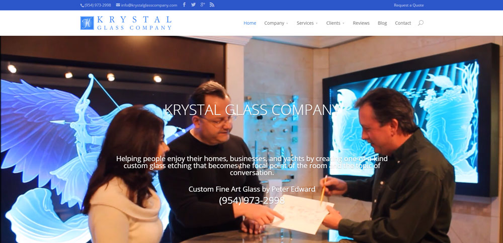
How I Built Our New Website by Karen Jurgens It’s been almost a month since the new Krystal Glass Company website design was published. The goal was simple- make it more user friendly and informative, easier to navigate and easier to find what you’re looking for when researching custom glass etching like big, awesome pictures that show lots of detail. The reviews are very positive. Thanks to everyone that responded with their comments, especially the loyal fans who gave generously of their time critiquing all the pages with me. The question I’ve been hearing a lot lately, especially from fellow small business owners who would like to do the same, is “How did you build it?”. It’s no secret. I used WordPress. It’s an easy-to-use open source CMS, content management system, and there are loads of resources available to help get you started. WordPress is huge, used for millions of websites and seen by tens of millions of people every day. I needed something that is easy to edit because we are constantly adding new pictures of our completed art glass projects. The best part about WordPress for me is that you don’t have to be a graphic designer or know any HTML code. Themes, or templates, provide the basic layout and page design, colors, fonts, etc., and you can customize them. I used a theme called Divi by Elegant Themes for the Krystal Glass Company website design. Elegant Themes is one of many companies that offer WordPress themes. They published a great post recently called The Best WordPress Courses To Take Online. Because of its popularity, books and classes on WordPress are plentiful. I like...


